
Logo of the month: February 2011
February at The Logo Mix, I could call it the wonder month as it has a record number of logos posted and also our top logo selection had to be increased to the best 10 logo designs. We usually select the top 5 logo designs posted on our gallery, but due to the large amount of exceptional logo design posted this month, we had to extend our selection to the best 10 logos. There are so many things that caught our eye from outstanding execution to great ideas, from high level of detail to simple, but powerful illustration. Have a read and check out some of the best logos posted on the Logo Mix gallery in the month of February.
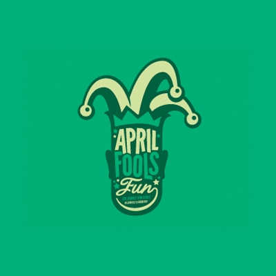
10. April Fools Fun Logo by Craig
The logo made it to the top ten by the amazing use of typography and the feel it manages to transmit without using much illustration. The vintage techniques of using paled colors and counting on typography for visual impact made this one a great logo design.
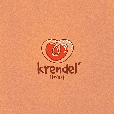
9. Krendel Logo by 13mu
The illustration is exceptional and the designer plays very well with the negative space combining it with an excellent use of color. The tag line "I love it" is very well rendered graphically and the choice of typography complements perfectly the design.
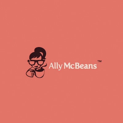
8. Ally McBeans Logo by Simona Munteanu
The impact of the logo relies on the smart monochrome illustration that is simple but very well achieved. The design has a vintage feel to it using a letterpress type technique for the illustration. The font choice is simple, but elegant and it completes the logo design well.
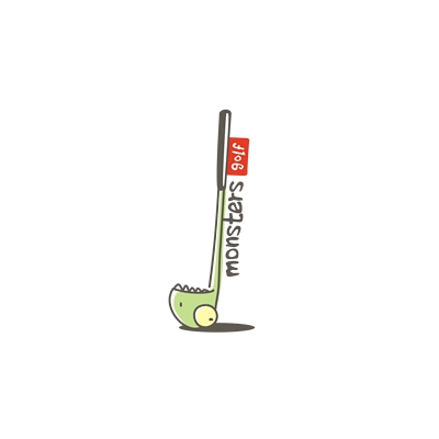
7. Monster Golf Logo by 13mu
Simple cartoony type illustration but with a certain elegance, specific to the game of golf. Beyond everything else the logo is fun and inviting. Using just some simple lines and colors it describes so well the very essence of the game.
6. Created Logo by Yoon
A great idea, fun and exceptionally executed. I must appreciate that the use of shading and the colors are just perfect. The logo design comes very well together and even if it uses different elements the designer manage to get them to build a strong design.
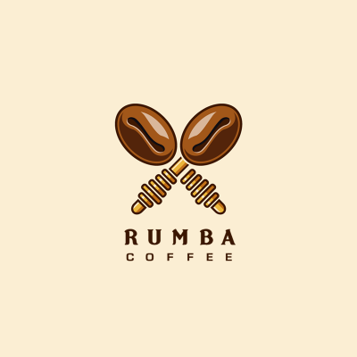
5. Rumba Coffee Logo by Lorena Mirbach
A very well illustrated idea that manages to put together the right elements with a perfect execution. The level of details is just right and the designer managed to use the right tones and shadings to create a lively icon. The typography of choice is very suitable and conveys the right feel to the logo design.
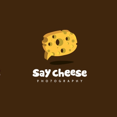
4. Say Cheese Logo by webcoredesign
The fist thing that stroke me was the perfect combination of illustration and typography. They both have the right thickness and texture and the message conveyed is perfectly aligned. The icon is so well designed, it has the right angle that makes it dynamic and the floating effect lifts the design.
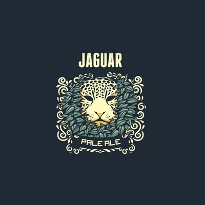
3. Jaguar Pale Ale Logo by Andrew Rose
The level of detail to this logo is just amazing, every element is carefully designed and perfectly placed into the ensemble to create a strong impact, an eye drawing logo. The elements have a natural dynamics and freedom that lifts the design off the page, giving it depth and bringing it to life.
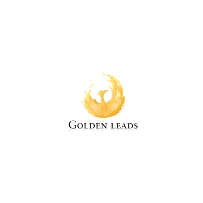
2. Golden Leads Logo by Miš i Pile
I am confident to say that this is the most elegant logo design posted on our logo gallery this month. Even if it was posted a while ago, as I saw it I knew on an instant that this was to be one of out top logos this month. The typography of choice is a simple serif font, very elegant, its sole purpose being to sustain the and complete the exceptionally illustrated icon. The golden bird, raising from its ashes as a Phoenix, floats in equilibrium, perfectly balanced while describing an open circle. The birds feathers in golden tones are very well designed, giving the logo a sense of natural. The proportions are well studied and it conveys the logo balance and stability.
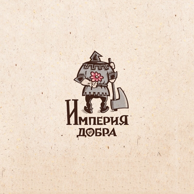
1. Logo of the month: The Empire of Good Logo by Simon Says
An awesome idea designed with an exceptional attention to details, with pixel perfect proportions and the right typography determined the crew at The Logo Mix to declare The Empire of Good the logo of the month of February. This logo shines not in terms of color but through a brilliant idea that was so carefully crafted, a work of love if I may say. The logo draws your eye and makes you stare and discover symbols, talent, knowledge and craftsmanship. An amazing logo design. Congrats Simon and thanks for posting.