Logo of the month: November 2010
Here we are at our second logo of the month selection. Each month we strive to appreciate the logo designers work posted on The Logo Mix Inspiration Gallery based on our visitors votes, the comments posted and our team input. The logo designs that made the selection this month detached themselves through minute attention to detail, simplicity and character. Unlike last month when the winner detached itself very clearly, this month the runner ups were very much on the same level and we had a hard time deciding the winner.
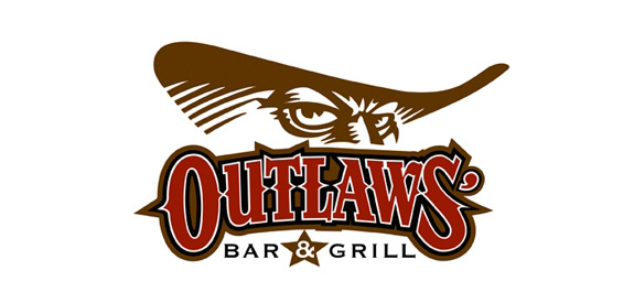
The fourth runner up: Outlaws Logo by Odney
The colors, the drawing and the choice of fonts work very well together and manage to convey the right feel to the logo design. The angry look and the hint of the cowboy hat tell a story that take you right to the wild west and the star remind us about the constant conflict between the sheriff and the outlaws. The fonts used are somehow an obvious choice but the styles and the carefully design details give the logo lots of character.
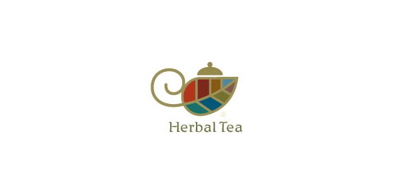
The third runner up: Herbal Tea Logo by Mike Bruner
The idea is very nicely conveyed with the leaf becoming a pot, but we must admit that the logo made our selection due to the outstanding use of color. The icon is so well designed that it says herbal tea even without the text. The proportions of the word mark are just right against the icon and the font is so well chosen. The logo elegantly says china and five o'clock tea, it says tradition and you just need a cooky to go with it.
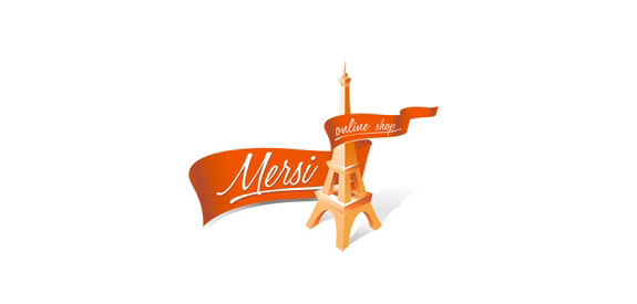
The second runner up: Mersi Logo by Sergey Babenko
We were rightly impressed by the minute attention to detail that was put up into this design. Le Tour Effel has the right angle and perfect proportions and the colors and shadings are just right. Also the ribbon seems so real and dynamic and the designer definitely found the perfect elegant script font to go along with it. Even if you cannot box this design into a regular geometrical shape the logo has stability and strength.
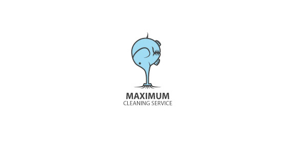
The first runner up: Maximum Cleaning Service Logo by Gedas
Personally, I just love this idea. It is a very simple and straight forward design that manages to put a smile on your face and make this logo memorable. Even the logo design seems so simple, the level of detail is just perfect. You feel like the entire imaginary carpet is just sucked up by the elephants trump while the little cute animal just curls with effort. A powerful but non threatening, friendly service that seems so handy is exactly what a cleaning company should offer.
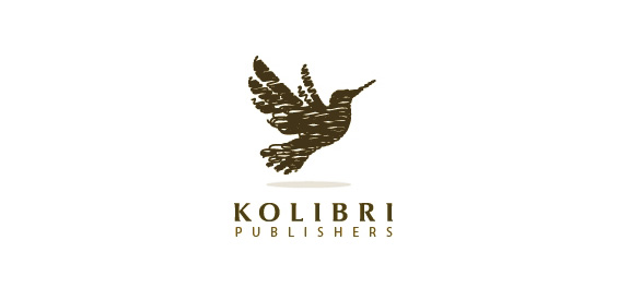
The winner: Kolibri Logo by almosh82
The drawing technique, the high level of detail and the lightness of the icon despite the dark color gave this logo design an edge and in the end convinced us to declare it the logo of the month in November here at The Logo Mix. Despite the fact that it is a monochromatic logo it doesn't lack neither dynamism, not is it blunt. The small bird is just about to take off from the canvas and seems to be taking shape from a pen thread. The typography is strong, has character and completes the elegance of the icon. Congrats almosh82 for a design well done!