Logo of the month: January & February 2012
It's been a while, but we're back in business with a great "logo of the month" selection. This selection is twice as hot as it brings together the best logo designs posted on the Logo Mix since the beginning of 2012. Check it out and leave a word of congrats to the talented winners.
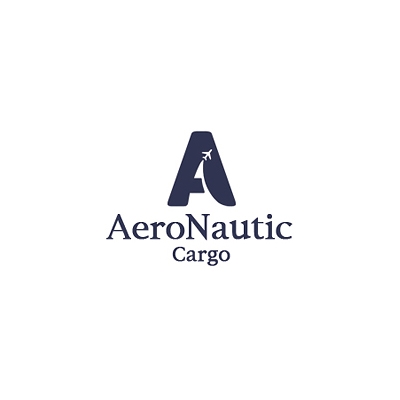
10. Aeronautic Cargo Logo by Coocishman
One of the nicest initial logo design I've seen lately, played very well with the negative space and the curved lines to give it dynamics and flow. The mark is bold, but also friendly with its rounded corners and appropriate icon. I don't think the typeface does justice to the icon, but it is functional and it works well.
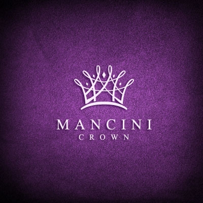
9. Mancini Crown Logo by Melanie D
Intricate and elegant, yet simple and geometric lines are used to create a fine detailed logo design. The crossing of the lines create small empty spaces that build up the logo like a nest giving it a nicely crafted structure. Simple and elegant serif font seem to be the perfect choice for the word mark.
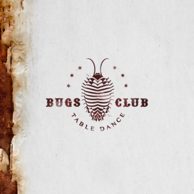
8. Bug Club Logo by Type and Signs
I love the clubby feel of this logo and almost see it on a branded coaster in some cool pub. Great western style typeface accompany the beautifully illustrated bug that almost make you dance "la cucaracha".
7. Bloom Logo by almosh82
Simple and powerful repetitive shapes and used to create this beautiful blossoming logo design that is strong and memorable. The way it is designed, the logo offers a great starting point for a branding system.
6. Royal Paint Logo by Type and Signs
Another great word association illustrated with so much grace and care to create an elegant design achievement. The elements are right and the lines are geometrically ordered and drawn. Great choice of font as well to pick up on the curves of the icon.
5. Art Home Logo by 1ta
The handcraft feel and the intended sloppiness of the lines convey the right message to this logo. The sketchy style of the icon (carved from the two initials of the word mark) and the brush typeface are so perfectly balanced and complete each other so well.
4. First Pres Logo by atomicvibe
This logo design is an amazing achievement with a great design style and beautiful color scheme. The awesome illustration is accompanied by perfectly balanced typography that is simple, but with a lot of character. A greatly awarder logo from a really amazing designer.
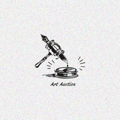
3. Art Auction Logo by 1ta
A double headed auction hammer that writes like a pen and paints like a brush, elements that are very nicely combined into a beautifully detailed piece of design. It is a very nicely illustrated idea with great attention to details and style for a great outcome.
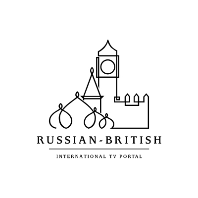
2. Russian British International TV Portal Logo by ancitis
Symbols of two nations beautifully united into a continuous line to create an original and memorable icon. The towers of Kremlin and the Palace of Westminster are welded together into outstanding design work.
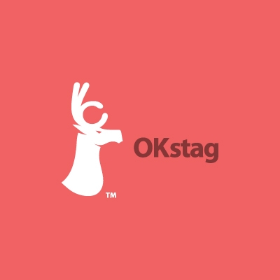
1. Logo of the month, January & February 2012 - OKstag Logo by anghelaht
The logo was just recently posted, but made it right to the top. Its smart, it has impact and it is brilliantly executed. The stag's horns shaped up as an OK sign is an outstanding idea and it is so well integrated into the design. The design has flowing lines and perfectly balance details that get the message across so well. Great work anghelaht and Congrats for an excellent design piece.
