Logo of the month: April 2011
Great concepts and great stories for the logos in top ten at The LogoMix this month. We've looked for famous, we've looked for excellent execution, we've looked for eye candy, but mainly we've looked for logos that manage to tell a story, logo designs that impress also the mind and the soul, not only the eye. Tough selectin agian, and it was exceptionally hard to get our top ten from our 15 logo design shortlist. They all were very good logos and some were very hard not to include in this list. In the end though, only one is declared the logo of the month and the winner is...
Well you really need to scroll down to see the winner, but meanwhile check the other great logos in the top ten selection this month.
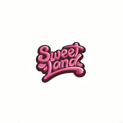
10. Sweet Land Logo by Alan Oronoz Madriles
Sweet Land found its way into our top ten this month only for the type treatment, what else… It is so well done and it looks so delicious that you may as well lick it off the page. The proportions of the type are perfect, it has balance and dynamics and the letters are perfectly weld together. The colors and lighting are well played, the logo has depth and even if its not very shiny the logo looks yummy.
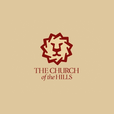
9. The Church of the Hills Logo by Glen Hobbs
Faith, no matter what kind, is about symbols and seeing things that are not obvious. Faith is about using things from the world seen to describe elements of the unseen one. Churches use these symbols to give a hint about what they stand for. A great mark of the lion, the obvious element, surrounded by hills (not so obvious) tell something about the church's faith and location. An excellent mark completed by an elegant font in a great choice of color, that also says something about the faith without being obvious. A very well achieved logo design concept.
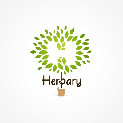
8. Herbary Logo by ancitis
This logo reminds me of Prince Charles of UK remarkable gardens, perfectly cut trees and bushes, amazing green leaves… With the Herbary logo I love the integration of the typeface with the graphic symbol, and the transitions of the natural colors that complete each other so well. Excellent choice on the soft rounded font that has been nicely manipulated to suit the design.
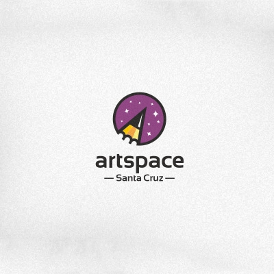
7. Artspace Logo by deiv
Simple shapes combined in a very creative manner to reveal a very balanced and strong mark. A very well applied retro style with clear lines and uniform colors. Excellent choice of typeface to complete this lovely logo design.
6. Toy Store Logo by ru_ferret
This reminds me of a little game we use to play as kids when we had to draw things with a single line without taking the pen off the paper. Of course this would be the pro version of that game. It is amazing how much beauty can be achieved with some simple lines, using a childlike play to create an appealing logo design. The flowing shapes meld perfectly with the earthy color to create an amazing mark.
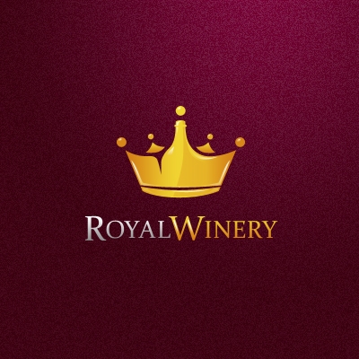
5. Royal Winery Logo by ancitis
I'll call it hide and seek with the royal bottle. First glance, nothing spectacular about this, otherwise very neatly designed logo. Yes, a great crown mark, very well balanced with an elegant font (classic choice)… but on the second look… have you seen the royal bottle? Yes, the one hidden in the crown. I'd say that's what makes this logo design to stand out.
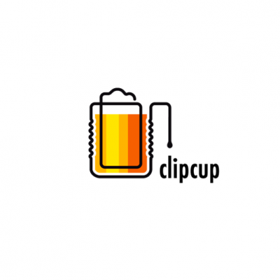
4. ClipCup Logo by Lorena e Bernardo
I can see this logo light up at the entrance of a pub located at the street level of an office building. Simple, strong lines, uniform colors, but with such a great impact. The clipart illustration technique taken to the next level, the double meaning words and unusual associations (an office tool + a pub vessel) are revealed again in this logo design achieved in the most pure Lorena e Bernardo style. A true visual joy. Thanks again for sharing.
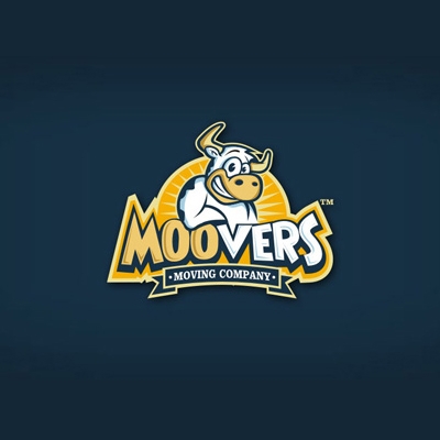
3. Moovers Logo by Alan Oronoz Madriles
I love the illustration on this logo and more than everything, the smile on that muscled up cow. You have to agree with me that this is a perfectly suitable design for a very inspired name. I mean you got to love that perfectly design cow. Some may argue that it is actually a bull or an ox, but the idea of a muscled up mooving cow is much more fun. Great color scheme and suitable typography are used to complete this great ranch style logo design.
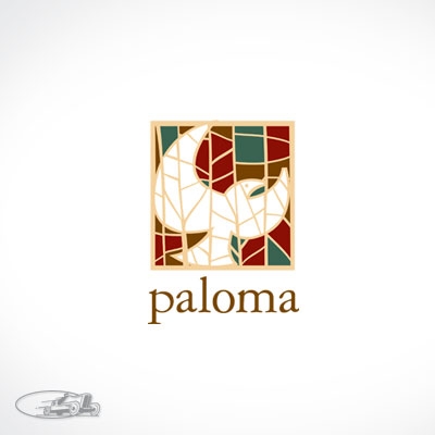
2. Paloma Logo by leighton_hubbell
What can be said about a logo design that has been featured in LogoLounge 3 and American Corporate Identity 22 and was designed by Leighton Hubbell? I'll only state the obvious… Paloma is a great logo design, excellently designed starting with the concept, the architectural influences, continuing with the outstanding illustration and and color scheme that says something about the location, everything comprised in a very well balanced mark. Other than that, I can only say that this is a logo I wish I had designed myself.
1. Logo of the month April 2011: LongShot Logo by Kepelikini
LongShot logo's got everything. It has a great concept, it tells an excellent story, it has perfect execution and it draws the eye in wonder even if it's not shiny or colorful. The different layers of meaning get your mind's cogs rolling, and, as in a cinematic long shot, it gets you to pause and meditate. LongShot is memorable and has impact not only on a visual level, but also through the story it displays. The logo is perfectly balanced, in harmony with the simple, spaced out typeface that suggest once again a long shot. Excellent work, Jeff and thanks for sharing.

