Before & After Logo Designs II. Which one's better?
We're here with our second run on which one's better, Before & After logo design comparison, an initiative that invites you to comment on visual achievement of rebranding programs. We don't have the data to judge a rebranding program and that's not the scope of these series of blog posts, but as designers, we can take a look and comment on which one's more visually appealing… the before logo, the one that was discarded as being old and useless or the after one, the result of an entire creative (and not only creative) and expensive (almost always) process. So grab your shrew tongue and state your thoughts.
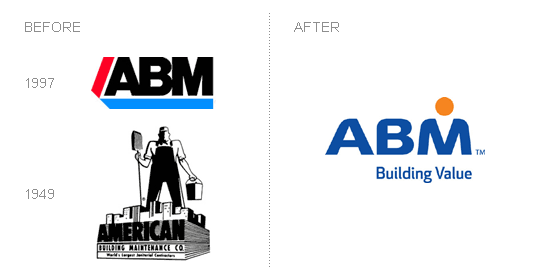
ABM
In my opinion: Don't really like it, but I can appreciate the way the logo heritage was used and graphically the rounded corners were nicely played to create the softened shoulders of the person's silhouette.
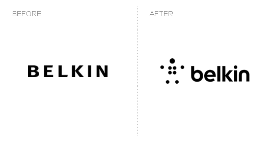
Belkin
IMO: Love the new typeface... simple and friendlier. Also like the symbol. Very nice work.
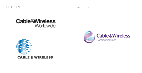
Cable & Wireless
IMO: Definite improvement, really like the "cable globe" design in the new logo. Not sure about the typeface though... It seems to soft for a tech company.
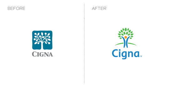
Cigna
IMO: New logo is crisp and nicely designed. Why do I find it a bit childish?
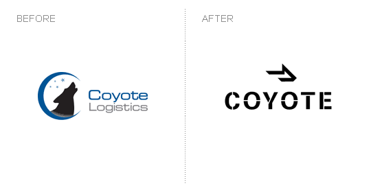
Coyote
IMO: The new Coyote design wows me. Simply amazing logo design work. How great is that arrow / coyote head icon. And the typeface slection is pure awesomeness! Love it, love it, love it! I say this is truly a logo worth redesining.
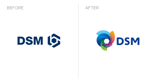
DSM
IMO: I like both of them. It's such a pitty that bold, strong and nicely designed mark had to be descarded. The before DSM logo is just as good. But you can't say anything, as the new one is beautifully achieved graphically. I'd keep them both.
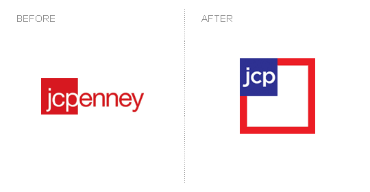
JCP
IMO: jcpenney again? And this time with a picture in picture solution? I was saying the last time that they might loose the "enney" and they have. But the new logo looks more like a brand extension than a redesign. Might be more strategy involved here than I can grasp from the visual acievement.
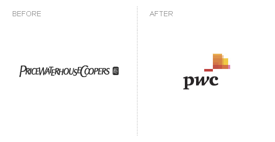
Price Waterhouse Coopers
IMO: I'll surely miss the old logo. It had such an established aura and you could sort of grasp the company tradition, heritage and strong roots from that logo. The new one? Well, it doesn't look like anything, it doesn't say anything visually... it looks like a color experiment gone wrong.
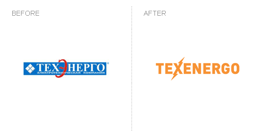
Texenergo
IMO: Nice design achievement. In fairness, anything would have been better than the old logo, but the simple and bold solution adopted for the new one is quite good... uncomplicated, crisp and clean.
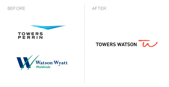
Towers Watson
IMO: Love the new logo. The simple and clean typeface is the perfect choice and the "TW" play is simply brilliant. Great work.