Dozen Flours - chosen design
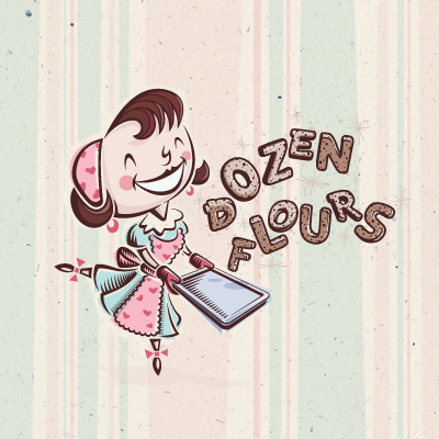
Chosen logo proposal for a baking blog, curated by a passionate baker who loves spoiling people with her delicious treats. Desired tone: Creative, quirky, joyful, homemade, comforting, approachable, feminine, playful, optimistic, and loving. Creative considerations: Client likes asymmetry and clever logos; loves color, but wants logo to reduce easily to black & white; loves swashy, swirly fonts rich with movement.
Rationale: Much more than just a logo, this illustrative concept delivers a comprehensive visual language through the collective assemblage of unified, supporting graphic elements. Inspired by the cheerful, wholesome image of a '50s-era American housewife happily baking in the kitchen, this option perfectly aligns with the majority of touchpoints raised in the creative brief. This versatile concept employs a main mark (shown) and several secondary marks that all share the same aesthetic properties.
More information & images: http://bit.ly/dribbble-DF-opt03. Full case study: http://bit.ly/av-behance-dozen-flours

