What you don't see is what you get.
Sometimes the white space, or the negative space speaks more than the touch of a designer's pen or mouse. Smart designers work not only with the stroke of color, but also with the empty space around or in between it. It amazes me sometimes what logo designers achieve by designing around the negative space. I've selected some very smart logo designs posted here on The Logo Mix that make you understand more than you can actually see. In those cases what you don't see is what you should actually get. Some of those logos we are able to understand quickly being more "in your face", while others, even if they seem obvious to the trained designer's eye, they are harder to get from the first glance and take a longer time to stare at them to see everything the designer has to transmit.
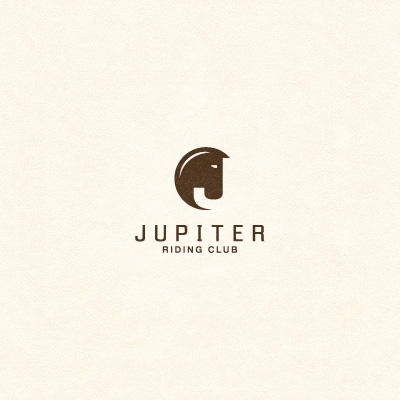
Jupiter Logo by Stelian Vasile
What you should see: the "J" letter
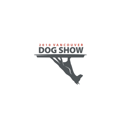
Dog Show Logo by 13mu
What you should see: the dog
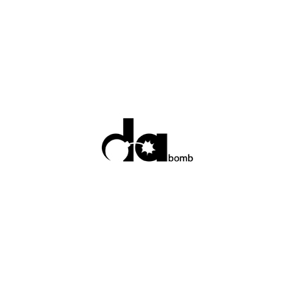
Da Bomb Logo by Ian O'Hanlon
What you should see: the bomb
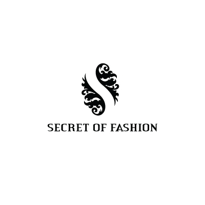
Secret of Fashion Logo by alteregologos
What you should see: the "S" letter
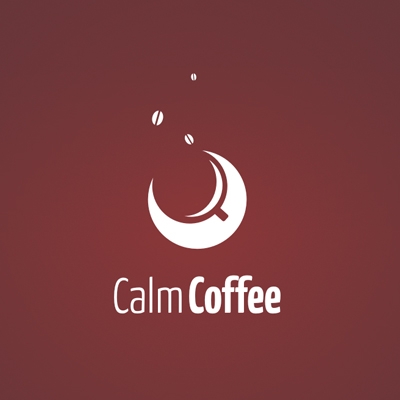
Calm Coffee Logo by Yasserj
What you should see: the coffee cup
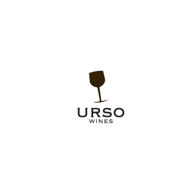
Urso Wine Logo by reghardt
What you should see: the bear nose
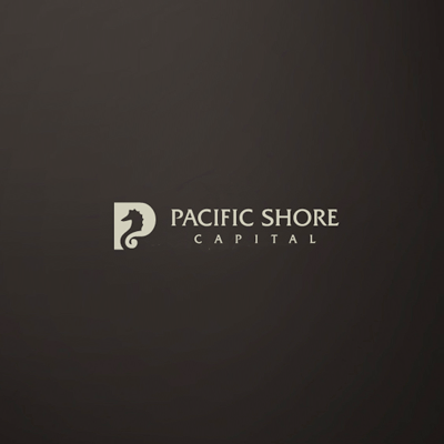
Pacific Shore Capital Logo by Mel Campbell
What you should see: the sea horse
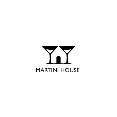
Martini House Logo by Eddie Brown
What you should see: the house
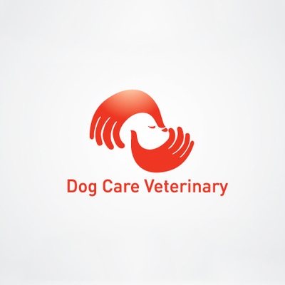
Dog Care Veterinary Logo by Gary Chew
What you should see: the dog head
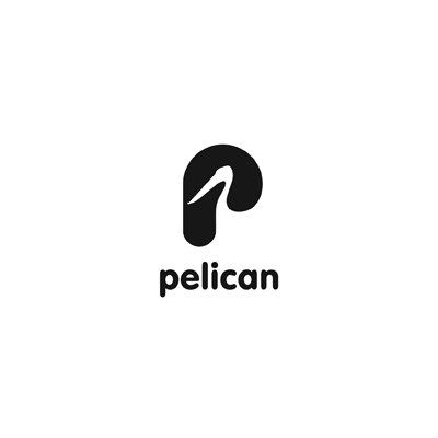
Pelican Logo by ru_ferret
What you should see: the pelican
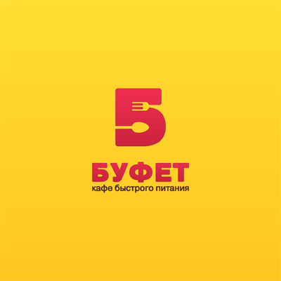
Bufet Logo by ru_ferret
What you should see: the spoon and fork
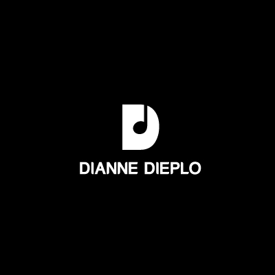
Dianne Dieplo Logo by Gareth Hardy
What you should see: the musical note
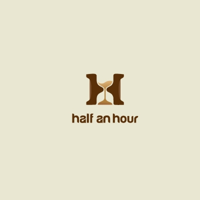
Half an hour Logo by Arnas Goldbergas
What you should see: the hourglass
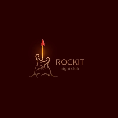
Rockit Logo by Arnas Goldbergas
What you should see: the guitar
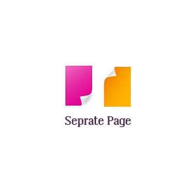
Separate Page Logo by Nima Elias
What you should see: the "S" letter