Logo of the month: May 2011
Great diversity, lots of style and a very tight competition to award the top logos posted on The Logo Mix gallery in the month of May 2011. From simple, monochromatic shapes to complex, multi layered designs, we've tried to cover and appreciate a wide range of logo designs and identify the ones that impressed us the most. Check out this great selection with the best logo design posted on The Logo Mix gallery in the month of May 2011 and I'm sure you'll find them truly inspiring.
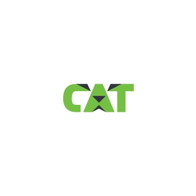
10. CAT Logo by Floris Voorveld
Surprisingly simple font manipulation but with such a great outcome and impact. The features, even simple, are so easy to identify and the character becomes so clear from a mere glance. Color scheme limited to two uniform color adding power to this already solid mark.
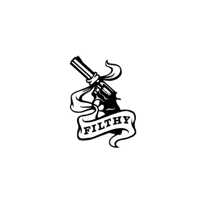
9. Filthy Logo by Dan Gretta
Even its a simple, monochromatic icon, we appreciated very much the illustration. Achieved with a limited number of details the logo has great impact, it is very powerful and dynamic.
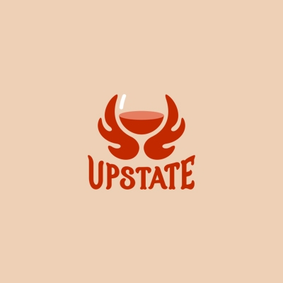
8. Upstate Logo by Yoon
The style of the icon is perfectly aligned with the typeface used creating a well together logo. The suggested glass is amazing and is perfectly achieved. Limited number of colors are used for a very powerful mark.
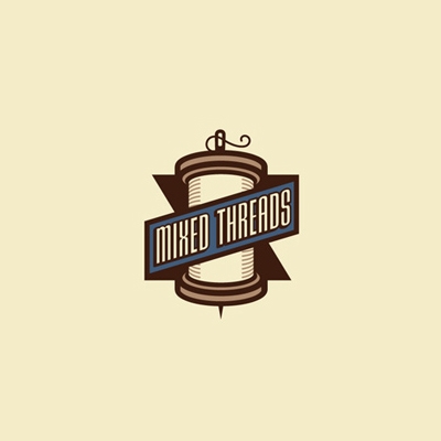
7. Mixed Threads Logo by Dan Gretta
Best sample of vintage style logo design posted on our gallery. Desaturated but bold colors, clear lines, details just enough to clarify the design, tall, bold and condensed typeface. A bold and powerful mark that is easy to remember.
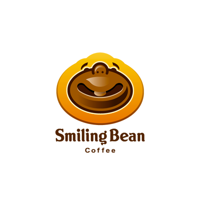
6. Smiling Bean Logo by Lorena e Bernardo
Great to have on our montly selection another cool achievement in the unmistakable style of Lorena e Bernardo. A cool idea as usual, great illustration again with just enough details, great color scheme and a perfectly suited font. It is a design that surely puts a smile on your face.
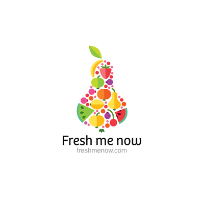
5. Fresh me now Logo by ru_ferret
A refreshing collection of fruits, in vivid colors excellently gathered in a pear shape that gives hight to the icon and makes it more dynamic. The surprising thing is the depth of the design achieved by using two slightly different shades of the same color for a fruit instead of using gradients. Despite the multitude of elements the logo is greatly balanced and the typeface is just perfect.
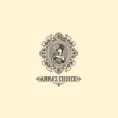
4. Anna's Choice Logo by Breno Bitencourt
So different in style from most of the logo designs posted on our gallery it draws the eye and makes you appreciate the amazing level of details. The lithography style is very well achieved, the Elizabethan ornaments are perfectly balanced, and not overpowering the design, the portrait has the right style and just the right amount of details. Great typography choice with perfect ornaments to equilibrate and sustain the icon. A true work of art.
3. Mr. Couch Logo by Arnas Goldbergas
The battle among the top three logos was indeed tough. They could all have made it to the logo of the month as well. But this is the final hierarchy. We love Mr. Couch. We think its an amazing logo achieved with simple lines, on a huge idea. It looks like a couch, but oh, how it looks like a face too. The pointy eyes, the eyebrows, the perfect mustache are perfectly designed in two tones of color and some simple, but well achieved shading. Excellent choice if typeface to complete the curves of this logo, for a mark that is powerful and memorable.

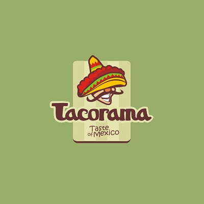
2. Tacorama Logo by Artem Dvorzhak
I would start with the face, or the rest of the face under the sombrero that is exactly how I would remember it from the cartoons I've watched as a kid. It is so Mexicano. The round, red nose (from tequila maybe), the wavy mustache and the large smile almost hidden under the sombrero hat create a perfectly identifiable mexican figure. Excellent choice of typeface for the main text and the tagline, the specific color scheme create a memorable and fun logo design.
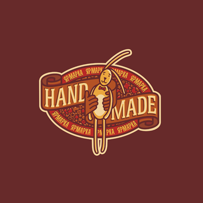
1. Logo of the month May 2011: Hand Made Logo by 13mu
Hand Made made it as the logo of the month purely on execution. We considered that the design idea was no better from the top three logo designs, but the execution is indeed outstanding. Amazing details, top notch color scheme and the perfect natural feel of the puppet bunny, the vintage swirly banners that become hands and the amazing little design elements in the background left us with no choice but to declare Hand Made, the logo of the month in May 2011 here at the Logo Mix gallery. Amazing job 13mu, thanks for sharing and CONGRATS!