Logo of the month: June 2011
A very though selection for the logo of the month in june 2011 here at the Logo Mix. Lots of great logos posted in the gallery this month, which made it hard to select the top ten. But the fact that none of the logos detatched itself as a winner it was even harder to select the logo of the month. These said, I think most of the logos in the top ten could have made it as the logo of the month, but the winner detached itself through the fact that there's something special about it, something that draws the eye and makes it memorable. Check out the selection, I'm sure you'll find it inspiring.
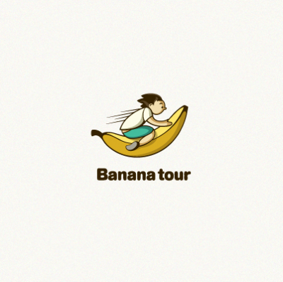
10. Banana tour by Igor Eezo
The excellent illustration reminds me of a cartoon I used to watch as a kid, the animated series of Nils Holgersson, staring a kid that travels around on the back of a goose. The execution is excellent and that banana looks so real. Excellent association with that rounded, thick, typeface. Great work!
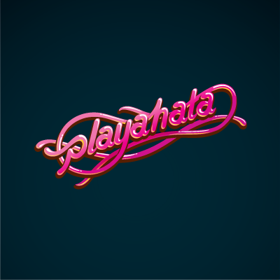
9. playahata by Igor Eezo
Amazing typography work, very appropriate for a Dj. It seems like the logo is made up using mixed up cables, the color choice is brilliant, extremely bright, strong clubby colors and the detail work is impressive. The light and shadow effects are very well achieved and completes this very cool logo.
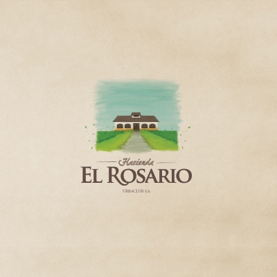
8. El Rosario by Pedro Pazmino
It's one of these logos that manage to inspire a relaxing atmosphere just by looking at it. There's such a great feel about this logo, serene earthy colors, simple elements, uncluttered design, they all create an eye candy logo that draws and keeps your attention.
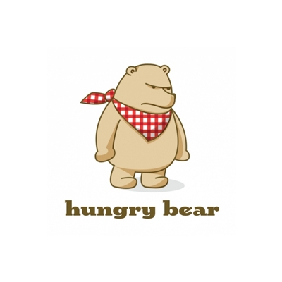
7. Hungry Bear by NancyCarterDesign
That angry face of a wild, hungry and powerful animal in wonderful contrast with the fact that we are dealing in fact with a teddy bear, a lively toy that also seems to have manners because it didn't forget its napkin... The irony seems perfect and the logo design is so well achieved.
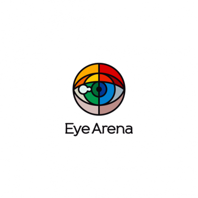
6. Eye Arena by Lorena e Bernardo
Let me start by saying that this is an amazing idea. The great value and beauty of stained glass is lying in the eye of the person that looks through it, admiring its rainbow perspective. Amazingly simple shapes are used in a masterly manner to create a powerful design that is striking and memorable. Congrats on the great work, L&B. You guys did it great again.
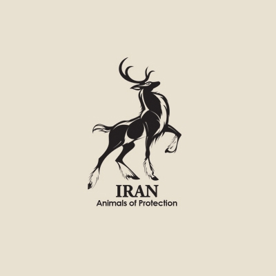
5. Iran by yektapour
A proud animal to stand for the rights of animals, an amazingly designed idea... pride and power that transpires from every stroke of the pen. An excellent work in black and white, with the designer emphasizing the power and the character of the animal using simple touches of light. Typeface is simple and empowers the icon. An excellent design achievement.
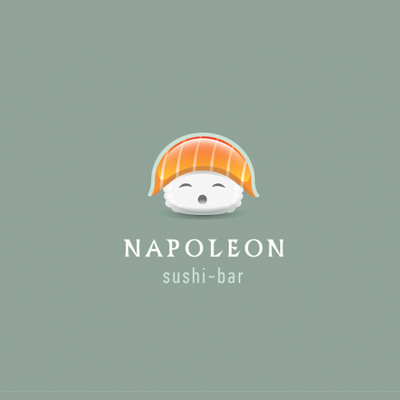
4. Napoleon by Alex Badovsky
A ball of rice and a slice of tuna in an incredible fun design. The name is very appropriate and the irony is perfect. Excellent design technique with a shiny twist that works so well here. The typography is well chosen for the title, with a hit of the époque, completed very well by a modern slim modern font.
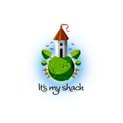
3. It's my shack by Lorena e Bernardo
In a place where creativity rules, your shack can look like a castle, with a flag on top, it can be placed on a round green globe where birds fly in a perfect blue sky, where trees grow at an angle and the fence is upside down. I guess everything is perfect in a world of excellent design. Great job, L&B!
2. Baby Photo by Mike Bruner
Huge amount of tenderness and care displayed in this amazingly designed logo. The author managed to transmit a great feel, designing a scene as if taken from Boccaccio. Curvy, chubby babies with angel wings floating in an air thick of love. The toned down colors, in a pure vintage style give a sense of heritage and importance to the company behind this logo.

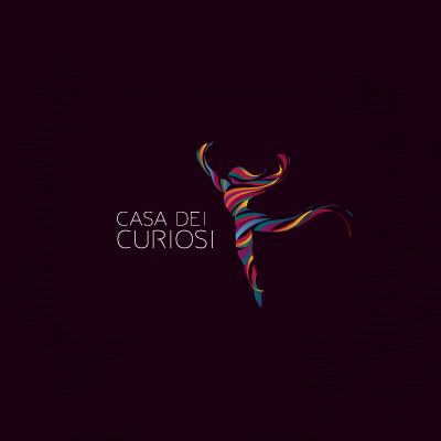
1. Casa dei Curiosi by Breno Bitencourt
Amazing burst of colors in the most dynamic logo design I've seen in a while. Strips of rainbow color wrapping an invisible body in a floating and dynamic dance pose that create a sense of lightness and inspiration achieving a flying like state. The icon floats imponderably towards a horizon line created by the slim typeface which anchors the design into the page. A truly great design achievement by Breno Bitencourt, makes the logo of the month in June 2011 here at the Logo Mix Gallery. Congrats, Breno!