Logo of the month: July 2011
We've seen great logo designs this month at The LogoMix, we've witnessed amazing creativity and inspiring work. However, there have been a couple of logo designers that marked the month of July 2011 here at The LogoMix with their outstanding work. For the past few months they constantly had at least one logo listed in our Logo of the month selections. This month they inspired us with great designs, from which we selected two logo designs to be listed in out top ten. One of those logos made it to the Logo of the month in July 2011. Congrats L&B, and thanks for all your contribution to this gallery! Check out the top selection of last month's best logo designs.
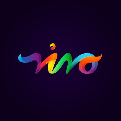
10. Vivo Logo by ancitis
Great colors in an amazing flowing shape that build a powerful mark. Vivo logo is a great proof that in some cases, all you need is a good shape and a beautiful color treatment to create impact. Every month we've featured a great typeface treatment in our top logo selection, and this one fits the description well, without being an actual typeface. Outstanding achievement.
9. Knockout Logo by Nadir Balcikli
The simplicity of this logo is absolutely great, the designer manages to create a bold mark using a simple concept that is in no way simplistic. Besides its intentional chunkiness, the logo has a great dynamics and it is placed so well in a virtual 3d space. Excellent choice of font, modern and bold, that completes the icon so well.

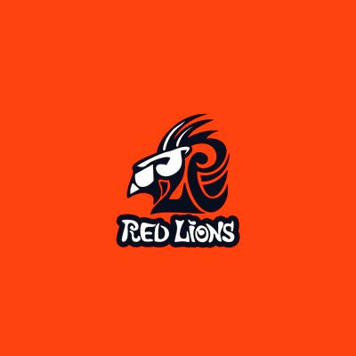
8. Red Lions Logo by epicantus
A well studied and elaborate logo design, worked in an outstanding african mask style, using a combination of aggressive and soft, curvy lines. The posture of the lion suggests pride and power, two characteristics that are so well surprised into the design. The custom font is perfectly aligned with the style of the icon, completing so well a greatly designed logo.
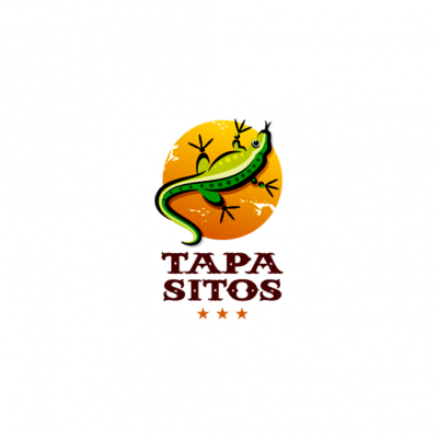
7. Tapasitos Logo by Lorena e Bernardo
I can see sombreros, smell tequila and feel the heat of the mexican sun just by looking at this logo. The excellent choice of color, the amazing illustration and the perfect typeface create the right feel for this logo and makes you even feel the taste of it. Needless to say, this great logo has perfectly drawn lines and an amazing font. One of those logos you wish you could've designed yourself.
6. Childhood Logo by Alexey
I'm amazed by the clarity of the lines and the perfect color tones used to create and amazing badge style logo design. Excellent use of the negative space, and great dynamics achieved by enhancing the icon beyond the badge boundaries. The subtle lines and tones are used to create elegance and finesse.

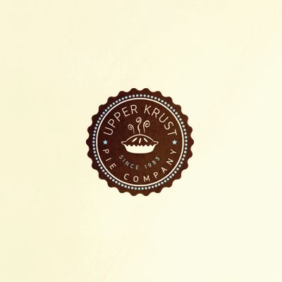
5. Upper Krust Logo by almosh82
One of the best badge logo designs I've see in a while and we can't say there aren't a few out there. It ticks all the characteristics of a great badge style logo, but it also stands out through the high quality of the details and perfect illustration. The lines are tidy and the elements have enough space to breathe and stand out. Graphical elements are not used in excess and each line has its well studied place. Typeface is simple and tall and the colors and bold, but with the right vintage feel to it. A remarkable design work.
4. Tour Expert Logo by Alexey
True genius skills were put to work to design this amazing logo in the most pure vintage style. The dynamics and the level of details are astonishing and the boat looks like it is about to come to life. Truly inspiring!

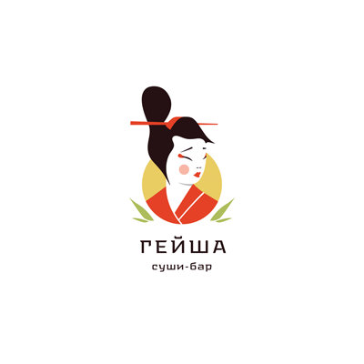
3. Geisha Logo by ru_ferret
You need to have a good understanding of a culture and a keen sense of observation to be able to portrait something as specific as a geisha. I think the amazing feature of this logo lays in the fact that it can portray so simply something that is so complex. In simple lines, the designer surprises the main characteristics of its subject, creating also atmosphere and imprinting the right feel to the mark.
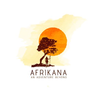
2. Afrikana Logo by almosh82
I could stare at it forever and never get tired of rediscovering that amazing african landscape, achieved by using just a few key elements: the high dry grass of the savanna, the lonely monkey tree, the african hunter and the hot super sized torrid sun. It feels like looking at a painting that manages to transmit the feel of the black continent. Very well surprised and put into graphics.
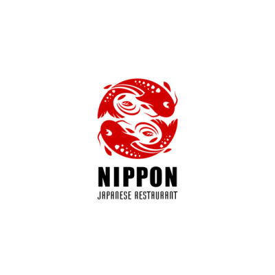
1. Logo of the Month, July 2011: Nippon Logo by Lorena e Bernardo
Probably one of the best monochrome icons I've seen in a while, this logo bears the mark of a great illustrator. I need to notice the perfect shapes, the simple, yet well studied details, the flowing and dynamic lines, and on the other side the subtle yet powerful symbolism. The yin / yang tension, the virtual circle that stands for perfection, the red Nippon sun that stands for the essence of the Japanese spirit (symbol of the Nippon nation found also on their flag) they are all there, carefully "hidden" in a powerful logo design. Congratulations Lorena e Bernardo, for another successful mark!