
Logo of the month: January 2011
We've seen a great start this year here at The LogoMix with an almost double number of monthly logos posted on our gallery. Following that line, the process of selecting the best design of the month was almost twice as hard. To select the best logo for the first month of 2011 we've considered the level of details, the character and the impact of the logos selected. On the short list you'll find not only very well illustrated logos, but also very smart ideas that caught our eye.
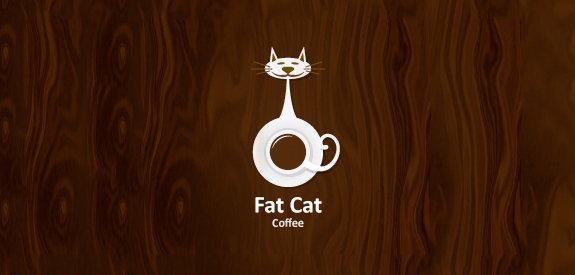
The fourth runner up: Fat Cat Logo by Gedas
In spite of the abundance of coffee logos posted on LogoMix gallery, Fat Cat logo brings a fresh approach. Its a smart design that makes you smile and inspires a sense of content. Deep rich browns in conjunction with the white space create this, almost corky looking logo. A well choice of simple font completes the design emphasizing its friendly appearance.

The third runner up: Blue Moon Logo by 82
A mark almost like a stamp in strong tones of blue, but with such impact, the Blue Moon logo has a subtle elegance and stands out through the detail of the illustration. The vintage look is achieved by the type of illustration adopted and the combination with an intentional negligently designed typeface. The logo is contained in a simple circle, retro-style that suggest the sun, the actual source of the light, and the full moon in the same time. A smart and very bold mark that is well designed and memorable.

The Second runner up: Bread & Breakfast Logo by S-de
Despite the simplicity, we had to appreciate a well designed idea. What way to better illustrate Bread & Breakfast than with a loaf of bread and a cup of coffee. The ingenious thing is though the way the designer plays with the negative space. You see the cup, then you see the bread, then you see the two elements together each designing and completing the other and then you say "awesome design". The design doesn't need a very deep level of details, in fact the charm of it lays in the "Provence" feel it transmits through the apparent negligence of the line, the dark brown and washed out blue. The typeface is a simple hand font, but picks very well on the lines of the bread loaf. A very smart design that makes me smile and dream of France country side.
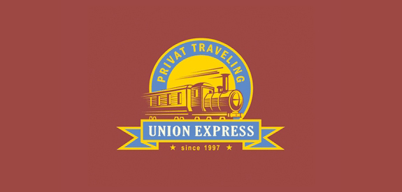
The First runner up: Union Express Logo by Gal
A very well designed logo along the lines of retro design styles in trend today. It manages to give the logo a sense of heritage even if the company is relatively new. The designer concentrated on details and managed to get the elements together to create a vintage feel and transmit the idea of a unique experience. The design is bold, well contained but has a certain movement that makes it dynamic.
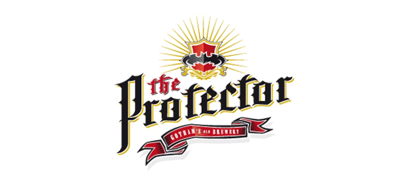
The winner: The Protector Logo by Lorena Mirbach
Bold design, rich colors, multitude of elements that come together as a whole, a complex and well designed logo, The Protector is the winning design of the month in January here at The LogoMix. The logo is an eye candy with its rich colors and different levels of details that invites us to explore it. The medieval typeface and the specific elements are combined to form a dynamic, yet fresh coat of arms type of signature. The design transpires history, heritage and class. Great job Lorena and congrats!