Logo of the month: August 2011
Even if we've had a massive amount of great logo design posted on the Logo Mix Gallery this month, even if we've got a headache trying to sort out the top ten out of probably thirty great logos that were as good as our final picks, even if we considered expanding the top selection (in the end we decided not to do it) to incorporate more logo designs, the logo of the month of August 2011 detached itself easily, and there were no dubs about it. Check out our monthly top selection and get inspired!
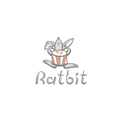
10. Ratbit Logo by alenadvertising
First of all, Ratbit is funny enough to draw your eye and make you smile. A weird bread of animal, the Ratbit gets the best from both, a rat and a rabbit. And of course, he owns a drum for some extra fun :-) The illustration is excellent, the character of the Ratbit is so well surprised and the vibrating typeface is just the perfect choice, though I expect it to have been customized to fit the concept. A fun character, wonderfully illustrated!
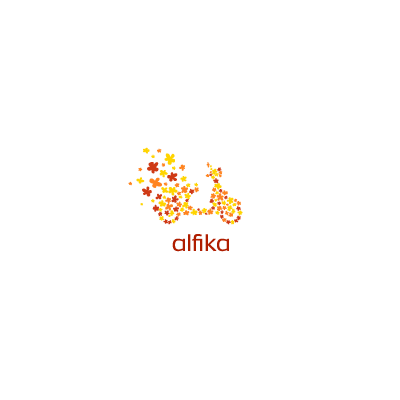
9. Alfika Logo by artvento
A nice, soft and colorful logo design, a happy logo design that managed to put a smile on my face. To me it looks so Italian, a kind of fantasy "Dolce Vita"… I can imagine myself driving that scooter through the small dreamy streets in a perfect Tuscany landscape. Great vivid colors and a minimalist and modern typeface complete the design so well. Lovely!
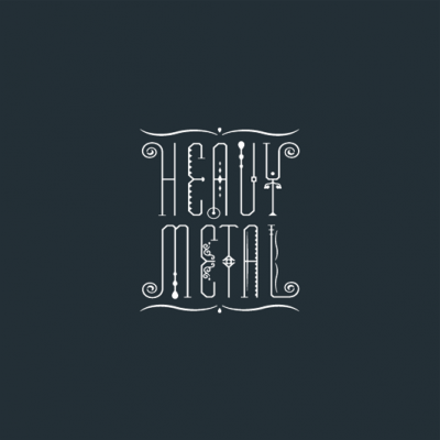
8. Heavy Metal Logo by Lorena e Bernardo
As usual, our top ten selection necessarily includes some kind of type treatment. I particularly love this logo, the custom type work coming from an expert in the field in my opinion. Cool job on it, L&B! Not sure what I could say on it, apart from the fact that it is very beautiful and that I can imagine a real life iron gate looking exactly like that.
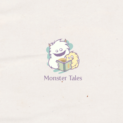
7. Monster Tales Logo by cpuentes23
Even monsters can be cute when in a parent-child relationship, especially when reading bed time stories. Even if the title has a sense of fear to it "Monster Tales", the typeface used is soft, contrasting with the words it depicts, and is ironically described into the illustration… soft, furry monster-lets reading happy stories. The concept is excellent, but the execution is also high standard, the relationship and love between the two monsters-lets being so well surprised by a very well trained eye and talented hand. A very cool little story in a cute icon.
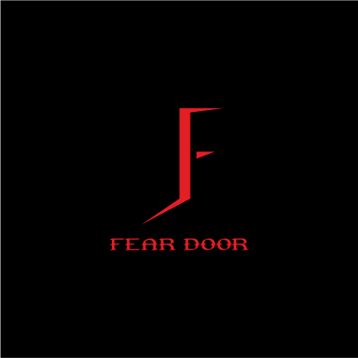
6. Fear Door Logo by VikkiV
You must love the way this logo design is played... with the cracking door that gives a sense of the unknown and mystery, building the letter F with its sharp, pointy edges that cut through darkness in deep red, building the feel of the mark. An opening door, an element that should bring hope is transformed into and element of fear by coloring the light in red and sharpening the edges. Excellent choice of typeface, that subtly explains the symbol without overpowering it. A great logo design.
5. M-Knights Logo by Lorena e Bernardo
We've known and loved the style of L&B's logos for a while now here at the Logo Mix, but I was once again blown away by the level of details and the love for design reflected into this logo. It's not a classic sports logo, but I find myself staring at it discovering a new shading that adds depth, a new element that creates a sense of 3D space, a new detail that pushes the design forward. A mere eye candy!
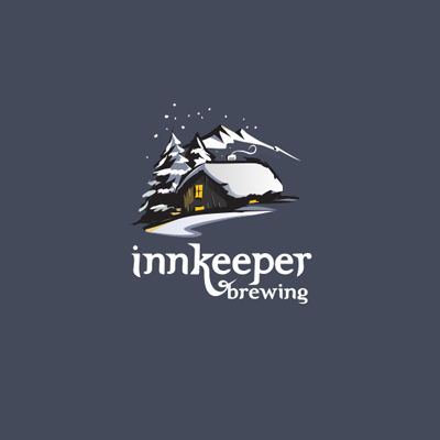
4. Innkeeper Logo by cpuentes23
I have to admit that I'm amazed by the warmth and cosiness of the winter landscape in this logo. The precise execution, the choice of elements, the refined detail and the well played light & shading effects make the Innkeeper one of my favorites logo designs. The great vibe and the feel of it makes me want to get in there somehow.
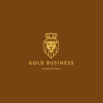
3. Gold Business Logo by ru_ferret
A bold mark, with clear and strong lines, stripped of any design noise or embellishments, Gold Business logo has been reduced to its pure essence, but in the same time it is keeping its dynamism and power. A great monochrome achievement, this logo design has impact, it is memorable and very versatile. The strong and simple corporate typeface works well with the icon, without drawing the eye from it. The use of gold color is an obvious choice and the brown, earthy background enforce the idea of caring and approach.
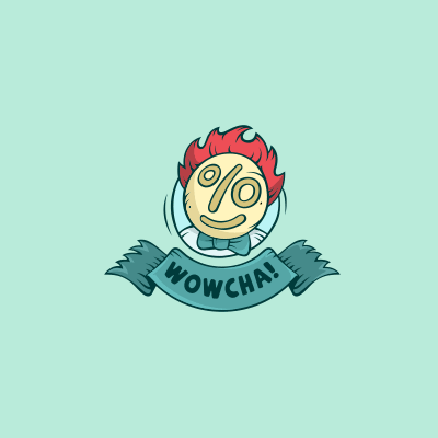
2. Wowcha Logo by Yoon
We just loved the illustration work on Wowcha logo! The concept is excellent with the smart incorporation of the % sign and the thought and care that have been put into the details. The light & shading are very nicely achieved, the design has a solid construction (the logo can be incorporated both into a circle and a triangle), it has dynamism but in the same time it sits well on the screen. The great hand drawn font and the vintage washed out colors complete well this great illustration.
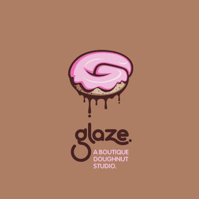
1. Logo of the month August 2011: Glaze Logo by atomicvibe
It has everything! Great concept (well documented with images on flickr), an absolutely amazing execution and an awesome custom typeface to go with it. Glaze logo is a display of talent, perfect technique, a great care for every little detail, excellent color scheme and wonderful composition. Now, I've probably finished my superlatives here and still not said enough about the logo. It looks so great that I would really want to take a bite. So, point achieved there! Congrats atomicvibe, on an excellent logo design!