Logo of the month: April 2012
The logo of the month top ten blog post is here, featuring the best logo designs posted on the Logo Mix Gallery in the month of April 2012. We've had some great logo designs posted last month, which made the decision to select only ten designs, difficult enough. We put our heads together and, heavy heartedly, pushed out of the list a few of our favorites to give you the best of the best logo designs. Check out the greatest top logo designs of the month of April 2012 and leave a nice comment for the worthy designers.
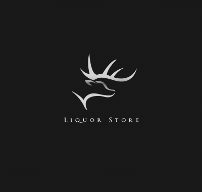
10. Liquor Store Logo Design by Ayaz Ahmed
Very nice and clean illustration, dynamic and aggressive, but with a certain softness that makes it more appealing. The elk silhouette is very nicely achieved with the help of simple lines, without any unnecessary details. Simple, but with enough character. Nice association with that clean, serif typeface, that gives a high end profile to the business it represents. I'd prefer the illustration in simple monochromatic white, but that's just a matter of taste.
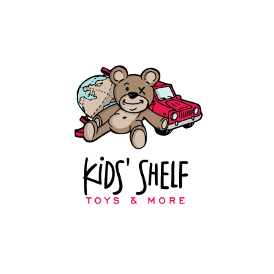
09. Kids' Shelf Logo Design by chrisworks
Full of character illustration, with lots of lovely details that make it stand out. The toys are nicely built with a certain childish careless that adds to the atmosphere of the logo design. We especially loved the patched eye and the loose belly of the toy bear. The elements are nicely thrown up in space and gathered to give equilibrium and dynamics to the logo. Perfect choice of typeface, both for main word mark and slogan.
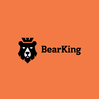
08. Bear King Logo Design by ru_ferret
Built on the bear's boldness, we especially appreciated the simplicity of the lines and its powerful impact. The icon is built using simple, symmetric lines and just enough details to make it versatile in both smaller or larger version. Nice association with a strong, but full of character typeface.
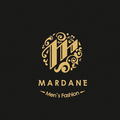
07. Mardane Logo Design by 1ta
We loved the type work on that "M" letter, and the well played circle icon achieved with the beautiful decoration. The illustration is intricate enough, but without loosing the perspective of the versatility of this logo. Enough space is given to the elements of the icon, to make it appealing in both smaller and larger format, and across different media. The typeface is simple, but given a certain something by adding some small decoration to the M and E letters. The slogan could be refined a bit further, but this is a great design overall.
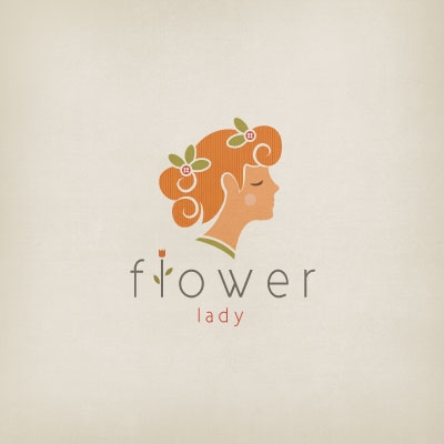
06. Flower Lady Logo Design by Melanie D
We were impressed with the amazing beauty of this logo design. The excellent details and the gorgeous colors make this logo design a true eye candy. We just loved the soft, beautiful lines, the whimsical atmosphere it transpires, and its finesse just amazed us. We think that the choice of typeface is simply perfect and we love the small, effective decoration added to it.
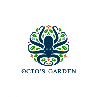
05. Octo's Garden Logo Design by Type and Signs
Crazy beautiful idea, greatly illustrated in the same TaS beautiful style that we grew to love so much. First off, we really liked the colors used here… they are so fresh and alive, making this logo so appealing. The great dynamics of the octopus, and its symmetry gives the logo boldness and balance. The typeface is already a TaS classic, we've seen it used in some amazing work before, but with some small alteration, it works so well here.
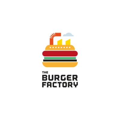
04. The Burger Factory Logo Design by Glad Head
You've got to love the creative boldness of this concept, that makes this design stand out. The beauty of it relies in using simple shapes in a creative way, hand in hand with a great color scheme that speaks directly to our brain combining words and emotinos. The strong, well balanced icon is brightly welded to a bold, geometric typeface, that is seems almost factory shaped with a metal cutter. This great association creates an awesome piece of design.
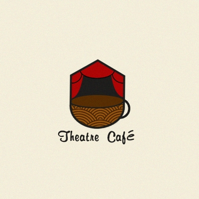
03. Theatre Cafe Logo Design by aliyev
Beautiful concept achieved in the best possible manner. I love the structure, the colors and especially the textures that add depth and make the logo almost touchable. The logo has impact, as it is comprised in a very structured shaped, and the details are simple, but so beautiful, creating an entire story inside our architectural container. The handwritten style typeface adds so much here, creating the right atmosphere, adding history and character to the logo, and inducing a special feel to the design.
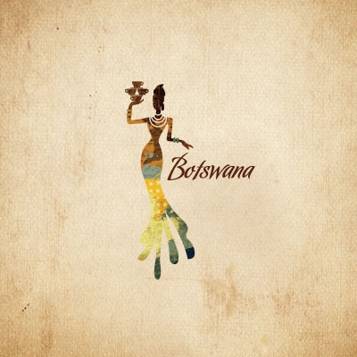
02. Botswana Logo Design by Melanie D
We haven't seen in a while a logo with so much character and infused with the local atmosphere it depicts. The shape and the colors look like taken from an African piece of artwork, with so much beauty and personality. The figure is so well studied and drawn, with great ornaments and details. Lovely typeface is chosen to go along this illustration and we especially like the unusual positioning and proportions.
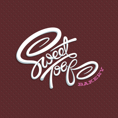
01. Sweet Toof Logo Design by atomicvibe
Well, atomicvibe has done it again with this great typography based logo design. The dynamics alongside the balance of this logo, the smoothness and its flowing curves, the ligatures and the way every beautiful letter is linked to the next one, the depth achieved with nice, sublet shadings… all in all make this amazing piece of design that scrams perfection. Nice typography, great execution. Congrats, atomicvibe, for an excellent logo design!
