Famous Logo Design History: KFC
To use or not to use a human face in a logo design... that is the question! One can argue over the subject, balance the pros and cons, but against all the odds KFC has done it using the Colonel Sanders' face as the company icon. A human face you can love or hate, you can like or dislike, but you will surely love this guy after you've tasted his chicken.

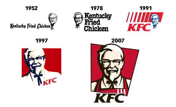
In 1952, Pete Harman, the owner of a fast food restaurant in Salt Lake City, marveled by Sanders special chicken recipes, convinced the Colonel to go together with him into the cooked chicken business. The special coating of herbs and spices made Sanders chicken famous and the business grew bolder. They named it "Kentucky Fried Chicken" and as a result of its popularity, franchise stores began to open all over the country. In the early 1990's the abbreviation KFC was used in order to move away from the fatty connotation of the word fried. Today there are more than 14,000 KFC restaurants in more than 80 countries around the world.
The KFC logo was kept consistent over the years and it depicts Colonel Sanders himself, while adapting to the visual shifts of the fast food industry. Although the textbook of logo design doesn't encourage the use of human face in a company logo, the smiling face of Colonel Sanders, in his white coat and black bow tie has become one of the famous icons world wide.
KFC has been one of the companies that kept its brand identity consistent and had only four small changes over the past fifty years of its history. In 2007, KFC launched the current logo in which the Colonel changed his white suit jacket for a red cook's apron, giving him more credit and empowering him as a chef. The new KFC logo has bolder colors and added dimension, depth and dynamism to the Colonel's icon. The red color in the logo has given KFC identity a more bold and energetic look and works well across different media from web to TV or print. The typography is also bolder and more assertive and gives the KFC logo a renewed energy and freshness, more appealing to its clients.
