
Cool and free fonts from The League of Moveable Type
It is Friday already and we are back with a nice collection of open fonts from The League of Moveable Type where you can find well-made, free & open-source, @font-face ready fonts. Enjoy.
Raleway
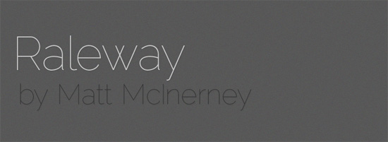
Raleway is an elegant sans-serif typeface, designed in a single thin weight. It is a display face that features both old style and lining numerals, standard and discretionary ligatures, a pretty complete set of diacritics, as well as a stylistic alternate inspired by more geometric sans-serif typefaces than it’s neo-grotesque inspired default character set.
Designer: Matt McInerney / Download & more info
Prociono
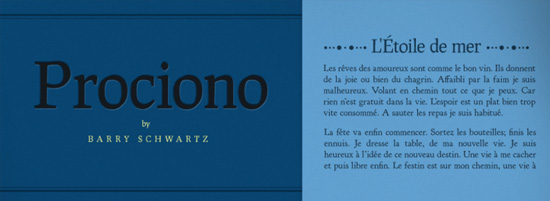
“Prociono” (pro-tsee-O-no) is an Esperanto word meaning either the star Procyon or the animal species known as the raccoon. It is a roman with blackletter elements. This font pre-dates the League and was placed by me into the public domain, so actually the restrictions of the OFL do not apply to it.
Designer: Barry Schwartz / Download & more info
Orbitron
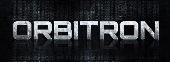
Orbitron is a geometric sans-serif typeface intended for display purposes. It features four weights (light, medium, bold, and black), a stylistic alternative, small caps, and a ton of alternate glyphs. Orbitron was designed so that graphic designers in the future will have some alternative to typefaces like Eurostile or Bank Gothic. If you’ve ever seen a futuristic sci-fi movie, you have may noticed that all other fonts have been lost or destroyed in the apocalypse that led humans to flee earth. Only those very few geometric typefaces have survived to be used on spaceship exteriors, spacestation signage, monopolistic corporate branding, uniforms featuring aerodynamic shoulder pads, etc. Of course Orbitron could also be used on the posters for the movies portraying this inevitable future.
Designer: Matt McInerney / Download & more info
Goudy Bookletter 1911
Based on Frederic Goudy’s Kennerley Oldstyle.
This font predates the League and is in the public domain.
A few words on why I think Kennerley Oldstyle is beautiful: In making this font, I discovered that Kennerley fits together tightly and evenly with almost no kerning. Thus the following words from Monotype specimen books are just: “[W]hen composed into words the characters appear to lock into one another with a closeness common in early types, but not so often seen in later-day creations.” These are letters that take command of the space around them; notice, for instance, the bowed shapes of the v and w.
Designer: Barry Schwartz / Download & more info
League Gothic
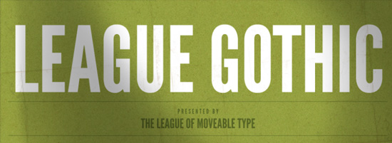
League Gothic is a revival of an old classic, and one of our favorite typefaces, Alternate Gothic No.1. It was originally designed by Morris Fuller Benton for the American Type Founders Company (ATF) in 1903. The company went bankrupt in 1993. And since the original typeface was created before 1923, the typeface is in the public domain.
We decided to make our own version, and contribute it to the Open Source Type Movement. It’s free, not only in price, but in freedom.
Designer: The League of Moveable Type / Download & more info
Sorts Mill Goudy
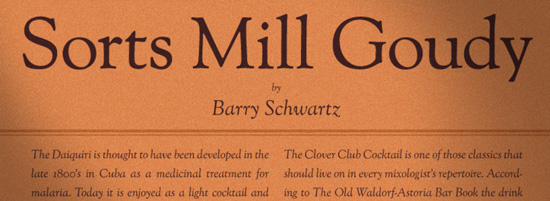
A ‘revival’ of Goudy Oldstyle and Italic, with features among which are small capitals (in the roman only), oldstyle and lining figures, superscripts and subscripts, fractions, ligatures, class-based kerning, case-sensitive forms, capital spacing. There is support for many languages that use latin script.
Older versions, equivalent fonts with different licensing, bug reporting, and software for font developers are available at my project page: http://sortsmill.googlecode.com
Designer: Barry Schwartz / Download & more info
Chunk
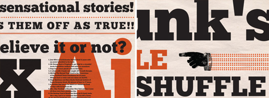
Chunk is an ultra-bold slab serif typeface that is reminiscent of old American Western woodcuts, broadsides, and newspaper headlines. Used mainly for display, the fat block lettering is unreserved yet refined for contemporary use.
Designer: Meredith Mandel / Download & more info
Junction
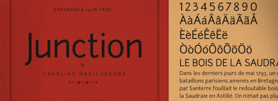 Inspired by my favorite humanist sans serif typefaces, such as Meta, Myriad, and Scala, Junction is where the best qualities of serif and sans serif typefaces come together. It has the hand drawn and human qualities of a serif, and still retains the clarity and efficiencies of a sans serif typeface. It combines the best of both worlds.
The new release of Junction includes a Latin 1 Western character set and lining figures.
Designer: Caroline Hadilaksono / Download & more info