Before & After Logo Designs I. Which one's better?
A timeless logo design may last for a decade, maybe two, or until a new board of directors comes in command, then it becomes dated and the identity needs an upgrade or a radical change. The logo design may still be beautiful, but the it needs to adapt to current times, markets and target groups. How many times, though, have you seen logo design upgrades, identity changes, rebranding programs that didn't work as well as expected and by the time the new identity was in place you already missed the old and beautiful logo? How many times new logo design or redesign seemed crapy, compared to the timeless good old logo that you knew and loved?
This blog post was inspired by Jeff Hughes, who suggested that it would be fun to take a look at identity upgrade programs and see if they are better or not. So that's what we're doing with this series of blog posts, and we need you to express your opinion. The big question is: Do you think the AFTER is better than the BEFORE? Do yo think the newer logos work better than the older ones or not? Take a look at the proposed logos and leave your comment!
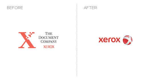
XEROX Company
In My Opinion: Nice redesign, but it seems so vague. The previous logo seemed a lot more apropriate.
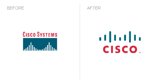
CISCO
IMO: Great work. The bridge is still there, but the logo is modern and powerful.
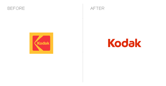
KODAK
IMO: Nice, but not even this won't change the general opinion that Kodak is best at camera films.
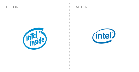
INTEL
IMO: Nicely done. Good logo design upgrade, just enough to get it up to date.
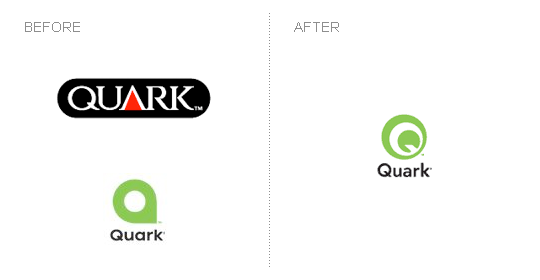
QUARK
IMO: Not sure if I really like it. Seems an improvement, but could have been done better, especially after the six month redesign fiasco, because it looked to much like the Scottish Arts Council logo.
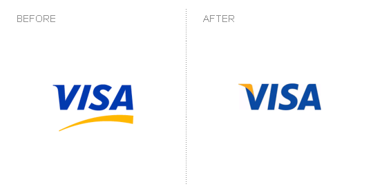
VISA
IMO: Nice and subtle upgrade, just to clean the logo and get it up to date.
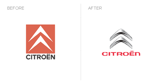
CITROEN
IMO: Definite improvement. Not sure about the icon / wordmark combo.
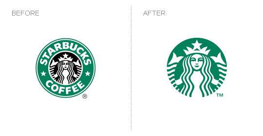
STARBUCKS
IMO: Beautifully upgraded. Very bold, though, in dropping the wordmark and assuming that everyone would know what this is about. And then, maybe everyone does!
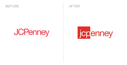
JCPenney
IMO: On the way to drop "enney" in to future? Otherwise why break the text like that. Not a fan!
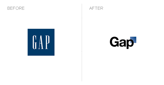
GAP
IMO: Enough words has been said and really dont want to make fun... but, WHAT? Loved the BEFORE Gap logo version so much. The upgrade just sucks!